
Wednesday, 2 October 2013


Tuesday, 1 October 2013
Concept Idea
In general, skateboarding is popular among teenage boys, so, I select black, wood and gold as my main colour. Not only they look manly, they also look fashionable. Inspired by the matrix that has 4 special characterr, the gunslinger, the architect, the oracle and the keymaker, I've change the architect to the doctor to harmonize them all in a style of steampunk.
For the first one, i chose black as a main colour of the deck. This one intentionally has the most simple looking among its series because some people like it that way and I don't want to loose any potential buyer ( if it for commercial ). I as well put an inspirational quote to sharpen its style.
Secondly, I've found one quote on facebook; 'Don't be afraid to fail, be afraid not to try.' I've change it to 'Don't be afraid to fall, be afraid not to try.' because, like this, it is more like skateboard. And the doctor below.. she's here if you actually fall. *laugh*
Thirdly, the oracle or a guy who sees future. I use eye glasses as a symbol. I also did complete his look with vintage clocks. Then I add a quote. 'Don't just live a life, build one.' in case someone doubt about his destiny. Here is the short answer.
Lastly, the key-maker, he is a guy in the Matrix that can go anywhere because he has every key for every single door. In real life, we most shut ourselves in the wall we made forgetting we can go anywhere we want and be everything we want. If we do whatever it takes or at least try. Also, we have to be open-minded for that. A world bound by border is outdated.
Tuesday, 24 September 2013


Thursday, 12 September 2013
Other Inspirations From 21DAY
Once I have the colour palette, now I'm thinking about the style and art movement. There is a guy who is, like, my Thai graphic designer idol. He passionates in making collage artworks ,both by hand traditionally and also digital ,that becomes such a cool idea just by adding lots of thing and blending it up, beautifully.

The reason why I like his art works so much is not because they all look mess-up but, in other hand, they're so interesting that you can look at it forever and never get bored. They are combinations of many ideas, some have meaning , some have story and some are just nothing. This is awesome!
Please click at the picture to see it in full-size.
Wednesday, 11 September 2013
Inspirational colour palettes
Skateboarder are mostly male teenager; so I think I should use classic color combinations like black and gray. Not only it is cool and looks manly, it's also easy to match your board with most styles of clothe and shoe. But to bring even more possible buyer like girls and hipsters, I'm considering of putting some gold in it like these picture I found on in internet. I think it looks gorgeous for every gender.


Skateboard Market Research
Last month, I was looking for a skateboard to buy. I was walking around the city, there was so few shops that sell boards; such as Billabong, Roxy, Ripcurl and some locals shop, but what I found out is those shops (in Sydney) was overpricing almost every single board except Penny board which is the only brand made in Australia. Maybe it is because of importing taxes. Then, I designed to do some online window shopping, read heaps of reviews from brand to brand and watched videos on YouTube. It's very hard to find the one board that fits me ( I've looking for a small board 24"-28" juct to cruise from home to school). But finally, here are my favourite:


The Arbor Collective


These brands and series are well recommended by skateboarder and long boarder hence they have a high quality components. What I like about them is not just that. I like how each series seems to be in the same style and direction. Moreover, it is a very clever thing that they use the advantage of wood texture and wood colour as part of the design. That, makes they look classic and fashionable. Creative.
Landyachtz

Wednesday, 4 September 2013
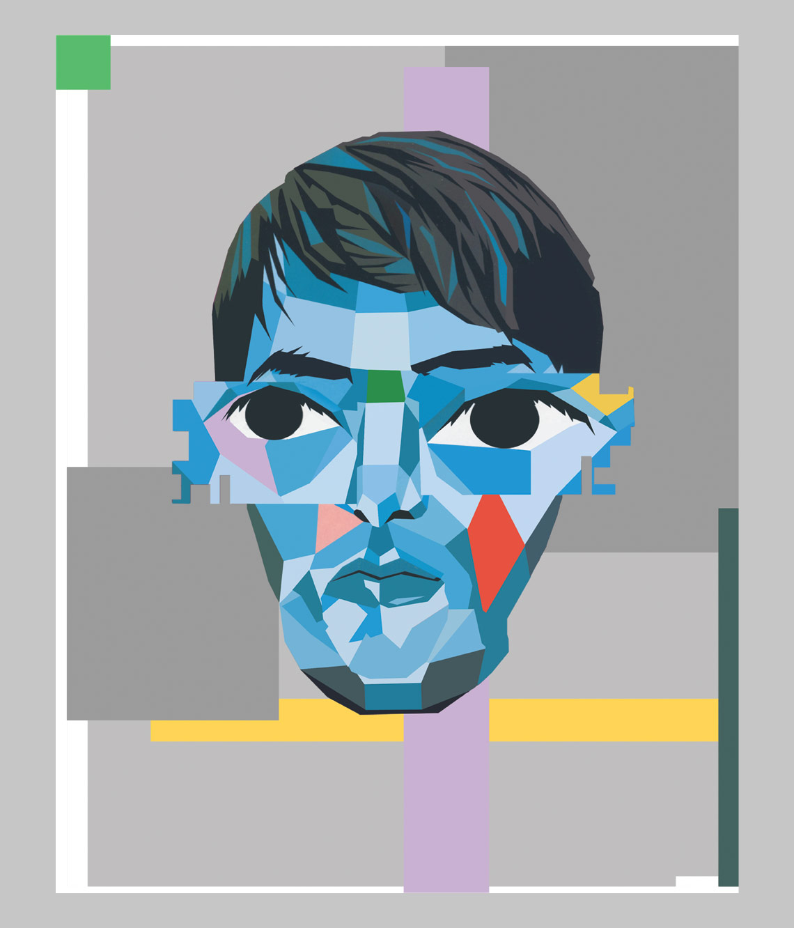
Final Portrait

Britney Expressive Portrait in Surrealism Movement.
Let's the game of thrones begins!
Wednesday, 28 August 2013
Britney Surrealism Portrait - in progress

Special Thanks:
Create Oil Painting Effect Using Photoshop CS6

Wednesday, 21 August 2013
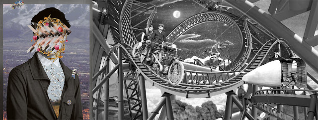
Concept Idea

At first, I was going to make her look a little more sad, holding the mirror that is reflecting her past, but I've changed my mind. I found her boxing photo-shoots which kinda awesome! Now the concept idea is this.
Two spears, one is the past wearing a mask, another is herself that beat all the bad things and proudly became strong. What lie between her present and her past, on the floor, are her albums. The reason is to show that , in life, everything is connected, by time.
Over than that, she will be wearing a princess crown to represent her title; The Princess of Pop. Still, she didn't get it for free. What it took to become a princess is mentioned in paragraph above. Another problem is she couldn't become a Queen. The Queen. After all these time. To show that she can't become a Queen I will place the list of pop singers on the wall, a world map to indicate that she has gone all over the globe and some posters. These will be something like ester eggs (Things that the audience can see and indirectly give the hidden information) in the background (which I've got an inspiration from Kill Bill).
Lastly, I will use the oil painting style to make everything to be more surrealism and I may blur out what not so important because this is a portrait not a poster, so, the focal point is Britney herself. From the song named 'Lucky', "She's so lucky, she's a star But she cry, cry, cries in her lonely heart, thinking If there's nothing missing in my life Then why do these tears come at night", These phases gave me an idea. Also, she once broke and she is still not complete. That's why I make her body apart, pieces to pieces, like a doll. Hence this is a story about a girl named Lucky, Britney... :)
Tuesday, 20 August 2013
Expressive Portrait's Mood Board

These are my mood boards for this project. Do you know that in early this year, Britney Spears announced that she had quit the X Factor USA to 'concentrate on her music career'?

However, a new report has alleged that the star actually quit after she failed to get a pay rise of $3 million. Having been paid $15 million for her role as a judge on the second season of the show, it has been claimed that the 'Baby One More Time' star was hoping to net $18 million for her appearance on the show's third season.
Even when she knows that last season, X Factor lost 20 percent of its 18-to-49 audience, with ad revenue dropping from $502 million in year one to $386 million in 2012, according to Kantar Media.
And I think, LOL! I must do some surrealism art for her.
Wednesday, 14 August 2013
Inspiration from Britney Spears
Who is Britney Spears? A Celebrity? A Singer? No doubt, she has had a crazy life. She got married young, had two kids and then got divorced. Then she went a bit "cuckoo," but now things seem to be back to normal ... or are they?
Why do I choose her? because she is, like, a super famous singer from my recollection since I was young. She also is a has-been that never was. (I was born in 1994) At the age of 8, Brit auditioned for the Disney Channel's New Mickey Mouse Club, but didn't get the part. Instead, she went on the talent competition show, Star Search, in 1992 and showcased her singing talents to the world. Next, her dream came true when she's 11 at Disney Channel's. So when I was a new born baby, she has already been known globally. And I've been following her news ever since.
Many years passed, I don't know why but she designed to get married at the very young age, and divorce 55 hrs. after that. Yes, it was not even 2 days , yet, again, she got married the second time and gave birth to her first son. As a new mom, Britney found herself in trouble in February 2006 after she was caught driving her car with her baby son in her lap. Her parenting skills became a subject of national debate, and critics said she was sending the wrong message to millions of her fans. I know it was a serious issue, but me and my friends always find celebrities news a joke, no exception for Britney. Check this out.

Further than that, she has been known for the title 'Princess of Pop' according to her over '66 Million Albums Sold'. Still, she can't be the Queen like Madonna who has over '400 Millions Of Albums Sold'. In this decade, Lady gaga is on her way to becoming a Princess of pop. But really everyone knows that the Princess of pop is Brittany Spears, no matter how many bad stuff that has happened to her in the past years she is the princess. But what's funny is what Britney have said. It inspires me. A lot. For the expressive portrait.

Credit:
http://www.prettyandstupid.com/idiot/8
http://www.cashquests.com/6-lessons-britney-spears-can-teach-you
Tuesday, 6 August 2013
Cubism Research
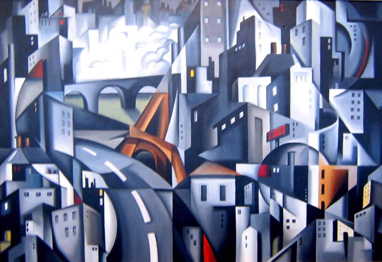
Unlike surrealism that try its best to make everything look real even if it's not, cubism makes things look dreamy and unreal. This doesn't mean it is not beautiful. It's still charming in its own cubic kind of style. What I like about cubism is that cubism has an ability to bring life to artworks by making normal picture on flat canvas interesting. It can be modernish or oldish. How it's really look vary by what tool, technical and stylistic aspects the artist is used.


Surrealism Research


From my point of view, surrealism is an art movement that has been known for long time from the past and still popular until today. It's a combination of imagination, dream vision, and real life, everyday life vision. For examples, a hot air balloon in the hallway of a palace surrounded by the sea, rabbit-headed humans or even rain of men in black uniform. It can be anything real or not, as long as it's look real. If you ask me I have to say that I like the movement of surrealism a lot because it can strongly expresses emotions without thought of the truth of time-and-space that we see every single day. It can by in or out this universe. Personally, I have been interested in Collage art which is kind of a subsurrealism as well.
Final Poster

Finally !
The .PSD file was 992MB at the size of A3
It took ages to save and upload buy yayy, here you are, the final poster.
Wednesday, 31 July 2013


Wednesday, 24 July 2013
Concept Idea

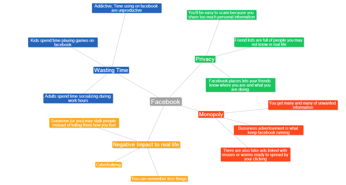
As you can see from my Mood Board, 'Facebook' is a social network website that can be addicted like a drug, literally. You can see many many people walk texting, facebooking or doing stuffs on their phone as if they are zombies in nowadays. For 10 years, Facebook has been developing itself ,and now has over 1.11 billion users from young childs to grand parents. More than that, 70 percents of local businesses use facebook for marketing, so you can get away from it no longer in this year. It's 2013.
For my poster, I plan to convey how addicted to Facebook people can be (or has already been) via a photo of everybody on the street busy looking at their phone instead of their surroundings. Overmore, I may use signs, ads or poster along the street that will finally lead you to Facebook. Because ads these day are like a propaganda and most of the times give you, one of the easiest way to contact them, Facebook.
It's not that I hate those commercial advertisement linked to Facebook but somehow I feel like it is too much. Not only on the street but even in Facebook itself, or even Youtube. After we all have to use Facebook all day, then it is easier for them to make advertisements, again. Ultimately, from these reason mentioned above, we end up browsing Facebook, getting unwanted information, loosing our privacy bit by bit and wasting our time on something unproductive.
Mood Board

" If you want to know more about
WHY YOU SHOULD QUIT FACEBOOK
check out our Facebook page :) "
Wednesday, 17 July 2013
Subscribe to:
Comments (Atom)